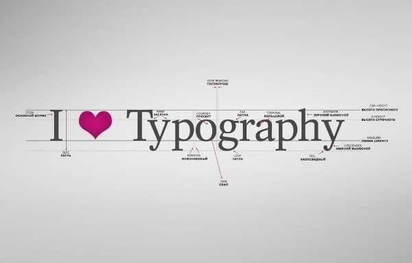
The main purpose of any font is easy readability, this is known to every graphic designer. That is why the most popular fonts are often those that are already beaten up and seem boring to an uninitiated user. Beautiful and unusual design of the site, of course, is good. Only a visitor can simply get bored of parsing intricate lines and squiggles and he will go to another resource, no matter how interesting the information offered to his attention is.
The five most used fonts
So, here are the most popular fonts for the site, which may get bored, but remain very easy to read. But this is the main thing. The user must first receive information, and it is through the text. He can also admire the pictures.
- Times Roman. Like it or not, but it is it that is used in most printed publications, and therefore in Internet resources. Simple, but tasteful, suitable for all occasions, especially if the text itself is informative, interesting and does not need additional distracting tricks.
- Helvetica. Widely used in logos, applicable to various alphabets.
- Verdana. This view is ideal for display on the screen, but is not always optimized for printing.
- Papyrus. Used often, but only for attractive headlines. For the description of this species does not fit categorically.
- Courier. The base is a set for a typewriter in Latin. Considered somewhat outdated.
Five popular fonts, each of which is original in its own way.
When and which is better to use
You can write a beautiful font that attracts attention, you can title. For the main text that carries a semantic load, it is better to choose a simple, readable, concise font.
At the same time, there are certain types that are commonly used to describe films, goods, etc.
How to choose
When choosing, everyone, first of all, focuses on personal preferences. I looked at the list of those offered, I liked this one – I chose it. And so it turns out that, in general, an innocent font becomes the most hackneyed and fed up. Although such an approach to the choice is quite justified. What you liked on an intuitive level, visitors to your resource will surely like it. The main thing is not to forget about such moments:
- convenience, as mentioned. This is the main thing, everything else is secondary. Here you need to take into account the spacing, the height of the letters, the spacing between lines, the color;
- correct application. You need to understand when gothic motifs are appropriate, when enlargement and bold or italics and other design tricks;
- compliance with the overall design. When everything is available and allowed, many people forget about the elementary rules for combining a font with the meaning of the text and other important points. Therefore, it is recommended, before making a final choice, to conduct a small analysis of already designed sites and draw reasonable conclusions.
Popular fonts do not mean the worst. In pursuit of originality, do not forget, first of all, about the main purpose of the font. Always be guided not only by your tastes, but also by common sense, this is a guarantee of choosing the best type of font.


